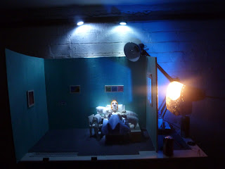
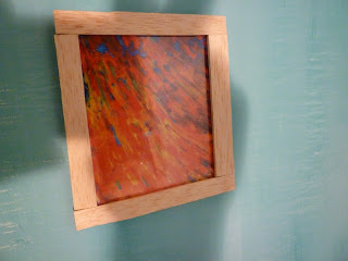
All done!, heres the final product. There are a few things about it i don't quite like, but had to compromise due to the 25 second specification, for example, i would like to have had the patient chart and the farmer's reaction shot held for longer, but this would have extended the length to over 25 seconds. The sound is also very quiet, but I care more about the animation than that. I used Mozart's Requiem for the music, or at least 25 seconds of it, no particular reason for that, but i think it works, particularly towards the end of the film.
The animation went better than expected, considering that i made the armatures myself, i wasn't sure quite how it would work out, it was a bit of an experiment really, but now i know that the armatures work well, i will make more in the future. They're not as good as the ball and socket ones, but i only have 2 of those and they cost a hell of a lot more.
I'm very happy with the lighting, at least for the first part, i think that the lighting change when the nurse comes in was a bit lurid, but it was necessary for the story.
Animating with glycerol was great, i animated it a bit too fast, but it's not really easy to control once it starts dripping, it did the trick though, and is now all over the set.
I also spent about 30 hours making that bloody nurse, and she's only in the film for the best part of 5 seconds, it was worth it though, and I'm definitely going to have to re-use her at some point in a future animation, along with the bed. (Oh, and i know that the Youtube video is 26 seconds long, the animation is actually 25 seconds long, the final shot of the logo got extended by about 0.2 seconds when i uploaded it for some reason.)
Thursday, 2 February 2012
BAA - Logo
Incorporating the BAA logo into my film was a bit harder than i expected, originally, i was going to have the logo on the back of the nurse's clipboard, but her hand covered most of the back of it, so i decided to try a put it in one of the paintings on the wall, but i scrapped that idea because it was crap. I then had an idea that would have involved the logo sliding down the outside of the window, but this seemed pointless and had nothing to do with the story. So in the end i decided to replace the farmer's patient information on the clipboard with the logo, and basically just chuck it on the floor, implying that the nurse had thrown it in exasperation. I will end the animation with this shot.
I hand drew the logo because it suits the 'handmade' look of all my props, plus i don't have a printer...
I hand drew the logo because it suits the 'handmade' look of all my props, plus i don't have a printer...
BAA - Mid shoot clean up
Filmed a little over half of the film now, it's going quite well, apart from a few reshot scenes due to camera issues, and switching from shooting at 24 fps to 12 fps, as the animation was just far too fast. now that the nurse is about to enter the scene, i have a chance to clean up the set a bit. The farmer has slumped a bit too much, and one of his legs has fallen off, along with one of the sheep's heads (his eye came out too, due to the glycerol getting in his eye socket.) I also need to re-arrange the pillow and duvet, as they have both moved a bit too much to the right of the bed during filming. Also, there are eyelids and glycerol everywhere...
BAA - Research
Another film i watched for research is an odd little animation called 'Tomorrow' directed by Bob Lee. The film itself, in terms of story and characters, whilst interesting, wasn't really inspiring, the lighting in the film was fantastic, and very well conveyed the anguish of the main character. This is exactly the sort of lighting i wanted for my film, particularly using a blind to create a unique effect.
Heres the film - http://vimeo.com/33974752
And a screenshot of the lighting
Heres the film - http://vimeo.com/33974752
And a screenshot of the lighting
Wednesday, 1 February 2012
BAA - Research
Meant to post this a while ago, my research for this project was, unsurprisingly, 'Wallace and Gromit' and 'Shaun the Sheep', particularly the latter, as the show has no dialogue and all the story is told through facial expressions and movement, a technique i will be utilizing extensively. I have avoided imitating Aardman's model-making style, and to be honest I'm not a huge fan of the look of their sheep, although using Glycerol to animate the sheep's tears was directly inspired by the crying sheep from 'A Close Shave'. Also my farmer and the farmer from 'Shaun the Sheep' do look somewhat similar, especially the hair, but that is unintentional, or i did it subconsciously. (i like my farmer more anyway, he has eyes.)


BAA - Cut Sheep
Unfortunately, due to the positioning of the camera, i have to cut one of the sheep, guess which one? yes it's the retarded one. I was originally going to have 2 on either side of the bed, but it didn't work out with the camera angle i wanted, so i put 3 on one side and 1 on the other, but i felt it would have been pointless to have a single sheep on one side, as it would be out of shot for the majority of the film, and then randomly appear at the end, so most people watching would be wondering where the hell this sheep came from, and might mistakenly believe it has significance to the story, which it doesn't, so he's gone.
BAA - Finished set and lighting
Here's what the finished set looks like, with all the props and characters in place and the lighting that will be used for the first 2/3rds of the film, the last part will be when the nurse enters and shows the farmer that he is being an over-dramatic div, so to change the setting a bit, when she enters, she will turn on the light and 'ruin the atmosphere'.
BAA - Farmer + Bed
Heres the farmer in the bed, as he will be filmed and without the duvet, so you can see his 'legs' (but you're not supposed to see that...)
BAA - Chair
Made a chair, it may not even appear in shot, but i am planning to reuse it at some point in my next film.
Going to test it's stability by glueing a small piece of metal to the base of one of the legs, and hold it to the set with a tiny magnet.
Going to test it's stability by glueing a small piece of metal to the base of one of the legs, and hold it to the set with a tiny magnet.
BAA - Props
Added some props to the hospital room set, mostly just pictures on the walls and some furniture, makes the room look less empty and helps it look more like a private room in a hospital, which is the look i was going for, mostly to avoid having to make multiple beds that you would find on a ward.
Not sure why i decided to make a syringe triptych, but i like it nonetheless...
Not sure why i decided to make a syringe triptych, but i like it nonetheless...
BAA - Bed
Making the bed for the farmer was a lot harder than any prop i've ever made before, it had to be sturdy enough to support the weight of the farmer and the sheep, and needed to have blankets, pillow, ect.
Bed starts with the mattress, which is just a big bit of MDF cut to size and rounded at the corners
Bed posts are 4 metal tubes, cut to size and smoothed at the tips so they're all the same level
Mattress is painted and the 4 legs are stuck to pieces of balsa, which are stuck to the bed
Material is stuck to the mattress to make it more mattressy, and side skirts are added to make it look like a bed instead of a table.
Backboard added, pillow and duvet added, (cheers to Angie for sewing the pillow together, i can't sew to save my life.) bed finished.
Subscribe to:
Comments (Atom)


